
The X That Doesn't Work (On Purpose)
A meme showed up on my Mastodon feed the other day — sjvn posted it publicly — and it stopped me mid-scroll. It's a size comparison: proton, neutron, electron... and then, smaller than all of them, the close-ad-button.
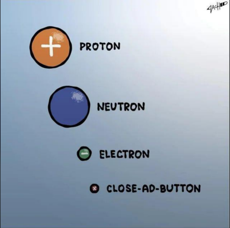
It's a joke. It's also a field guide to modern advertising UX.
A quick disclosure before I get into it: I run AdGuard Home at the network level and browser-based blockers on top of that — you can read more about the setup in the homeserver series. I'm not a neutral observer here. I actively block ads, and I do it because of decades of exactly the kind of abuse I'm about to describe — dark patterns baked into the user experience by design, and increasingly, ads themselves becoming a legitimate malware vector. Some people argue a non-abusive ad ecosystem is theoretically possible, and maybe they're right in the abstract. But corporate greed and thirty years of evidence have landed me firmly in the "I'll believe it when I see it" camp — which is to say, I'm not holding my breath. That context matters for what follows.
I've written about YouTube's ad blocker war, about tracking, about the general state of user-hostile design across the industry. But I've never actually just sat down and catalogued the X button itself — the one UI element whose sole job is to get you out of an ad, and whose entire design philosophy is apparently to make sure you never successfully do that.
So let's do that.
It's Not Bad Design. It's Good Design Aimed at You.
Here's the thing that gets missed a lot: it's not a bug — it's a feature. These companies employ some of the most talented UX researchers and interface designers on the planet. They A/B test button colors. They know exactly how many pixels a thumb target needs to be to register reliably on mobile. They have the data.
The bad experience is the output of all that expertise applied deliberately in the wrong direction. Dark patterns are deliberate design choices that ultimately steer users to act against their own best interests — tactics that benefit businesses by helping them increase some metric of interest to shareholders. The close button is a perfect specimen of the form.
The Taxonomy of the Broken X
Let me walk through what I've come to think of as the canonical close button offense list, because there are more varieties than you might expect.
The delayed X. You load a video, an interstitial fires, and there's a "Skip Ad" or close button that's grayed out. Fine — they paid for five seconds, whatever. But then second five arrives, the button activates, your thumb is already positioned... and you tap the ad instead. That's not an accident. The delay trains your muscle memory to anticipate the activation, and then the exact moment it activates is engineered to be the moment you've already committed to a tap location. You didn't misclick. You were set up.
The X that's part of the creative. This one is elegant in how evil it is. The ad itself contains a visual that looks like a close button — sometimes literally an X in the corner, sometimes a circle with something in it — that does nothing except open the advertiser's landing page when tapped. The real close mechanism is somewhere else, usually smaller.
The X that opens another layer. You dismiss the ad. Another ad appears. You dismiss that one. A "Would you like to subscribe?" overlay appears. This isn't really about the button anymore — it's about the whole system being designed so that "closed" is a provisional state.
The microscopic mobile X. This one shows up constantly on mobile. The touch target is technically present. It just requires the kind of precision tapping that human fingers don't actually do, especially when you're holding your phone casually. Apple's own Human Interface Guidelines specify 44x44 points as the minimum tappable area. Somehow ad close buttons are frequently exempt from this in practice.
The X that moves. Less common now, but still out there: the button that shifts position right as your finger descends. Or appears in a different location each time the ad type rotates. Enough variation to prevent your muscle memory from ever landing cleanly.
The fake X in the corner of a banner. You tap it. The whole ad opens. The real close mechanism — if there is one — requires a second interaction you weren't expecting.
The X that's off-screen. The ad loads, and the close button is just... not visible. Scroll down, it's below the fold. Zoom out, there it is. On mobile especially, interstitials and popups that render controls outside the viewport are a known pattern — and while I'll cop to running zoom for accessibility reasons, this one hits users at default settings too. The button exists. They just made sure it's not where you're looking.
(And yes, there's another "X" that doesn't work — but that's a whole separate post or probably posts.)
Dishonorable Mention: When They Skip the Pretense Entirely
The above assumes there's at least a nominal X somewhere. But a whole category of attention-grabbing has dispensed with that fiction entirely.
The app launch splash. You open Amazon to check an order. You open Walmart to find store hours. Doesn't matter — first you're getting a full-screen promo for a show, a sale, or a membership tier you didn't ask about. Sometimes there's a delayed X, right back to the classic playbook. Sometimes the X works fine — but it still took a beat to appear, and your attention was already captured. The app that you opened for a specific reason has decided your first moment in it belongs to them.
The baked-in promo element. Worse than the overlay, because at least the overlay admits what it is. This variant just... is the top of the page. No X at all. A full-width promotional graphic or autoplay video sitting there as though it's content, sized so it fills your viewport completely on mobile. You scroll past it like you're expected to. Because you are. They didn't forget to put a close button on it — they made a deliberate choice not to.
The mid-article viewport takeover. You're reading. You're in a rhythm. And then the entire screen becomes a subscription prompt, a newsletter nag, or an ad — perfectly sized to fill your view and kill your momentum. Technically you can scroll past it. "Technically" is doing a lot of work in that sentence. There's no X because they don't need one. The wall is the message: stop, look at this, and reconsider whether you really want to keep reading for free.
None of these are ads in the traditional sense. They don't involve a third-party advertiser or a media buy. But they're built on exactly the same logic — your attention is a resource, and they're helping themselves to it before you've consented to anything, every single time you open the app or load the page.
This Is Documented. Extensively.
I want to be clear that I'm not speculating about intent here. Dark patterns are deceptive design strategies intentionally crafted to manipulate user behavior — they undermine user autonomy and prioritize business goals over user well-being. There's a whole academic literature on this. The FTC published a full report on it in 2022, then followed it up with a coordinated international study in 2024 finding that 76% of subscription websites and apps used at least one dark pattern — and 67% used more than one. They've since sued Amazon and Adobe over it. Over in Europe, the Digital Services Act explicitly bans dark patterns, and the EU is now drafting a Digital Fairness Act to go further.
The industry has had to respond to this legally in Europe. In the US, the FTC has taken real swings at it — with named executives, not just companies. The fact that it took laws and lawsuits to get here tells you everything about whether any of this was intentional.
Why the X Button Specifically
You might wonder why I'm spending a whole post on what is technically a very small UI element. Here's why it matters beyond the annoyance.
Every time you fail to close an ad, one of a few things happens: you accidentally tap into it (accidental click — extremely valuable to advertisers regardless of intent), you watch more of it than you intended (impression time — also valuable), or you give up and let it run (desired outcome). The close button is the defense mechanism users have against all three of those outcomes. And the metrics justify the design — higher accidental engagement, longer view times, and lower skip rates all look great in an advertiser dashboard. Nobody in that meeting is asking whether the user meant to do that.
It's the same logic as everything else in this series. Make the exit hard enough that most people don't take it. Not impossible — that would trigger complaints, maybe regulatory attention. Just hard enough that the path of least resistance is to give up and watch the thing.
The Broader Pattern
The meme I started with shows the close-ad-button smaller than an electron. The joke is the size. But the real observation is the category — it's listed alongside fundamental particles as though it's a natural phenomenon, something just found in nature.
It isn't. Someone made it that small. Several someones, in fact — designers, product managers, ad revenue stakeholders — all optimizing toward the same outcome, which is that you don't successfully close the ad on the first try.
This is the same industry that will tell you, with a straight face, that ads fund the free internet. That without advertising revenue, the content you love couldn't exist. That it's a fair trade.
Maybe it is, for some definition of fair. But a fair trade doesn't require trapping the other party into it. If the value exchange were genuinely equitable, the close button would be 44 pixels square, right where you expect it, active from the first second. The fact that it isn't is the tell.
I keep writing these posts because I think it's worth being precise about what's actually happening. Not "ads are bad" — that's a personal preference, and one I hold pretty firmly at this point. But "the close button is deliberately difficult" — that's a design choice. And design choices have authors.